
After conducting some further research and revisiting the essay question, these design ideas have been formulated from this. Based on my essay question and its connections to modernism, geometry, the unification of the arts and the ability to identify a universal language. Not only is there a small mock up of one or two possible solutions based on the ideas but these ideas have been pitched to a peer and compared based on their effectiveness and how appropriate it is in relation to the essay question.
Idea 1. - Inspired by the work of Herbert Bayer, looking at creating some 2D and 3D designs that explore the ideas of the Bauhaus designers work in a different form.
Peer thoughts - A more architectural solution, - interesting as it works in 2D & 3D. - More challenging. - Considerations of scale, shape and form needed.

Idea 2. Typographic poster exploring the architectural principles in architecture in a poster form. Using the ideas, grids, themes displayed in the iconic modernist architectural style. E.g Le Corbusier, Mies Van Der Rohe. Looking at the Villa Savoye - five principles, -
Pilotis – Replacement of supporting walls by a grid of reinforced concrete columns that bears the structural load is the basis of the new aesthetic.
The free designing of the ground plan—the absence of supporting walls—means the house is unrestrained in its internal use.
The free design of the façade—separating the exterior of the building from its structural function—sets the façade free from structural constraints.
The horizontal window, which cuts the façade along its entire length, lights rooms equally.
Roof gardens on a flat roof can serve a domestic purpose while providing essential protection to the concrete roof.
- Peer Thoughts - Too architecturally focused, May have been done before, Using other work.
Idea 3. A typeface displaying the geometric influences instilled in modernist design theory. Translating theory to practice, Using extended lines and shapes to highlight further the use of organised grids within modernist type.
- Peer Thoughts - Would already be similar to the Bauhaus type by Herbert Bayer, Out dated, May not align with how we read today, too uniform.
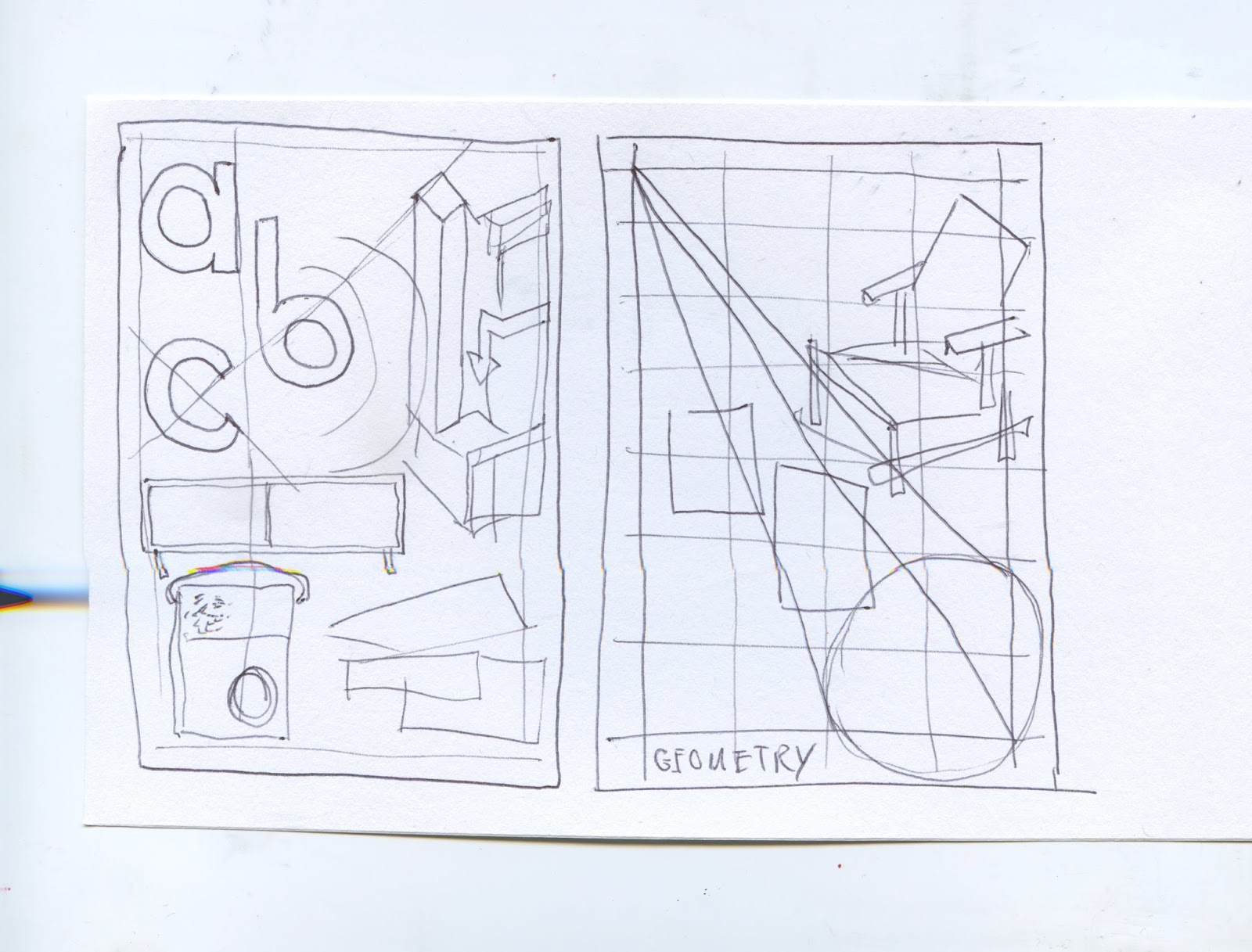
Idea 4. Poster highlighting the use of geometry in all aspects of modernism, art, architecture, furniture design, typography, fashion, etc. Really high impact graphic response.
- Peer Thoughts - Potential for a large range, in line with the essay, a visual response to the essay, relevant to target audience. The most appropriate idea and visually appealing.
Idea 5. Poster set, highlighting the universal ambitions of modernism, a high impact poster informed by the principles highlight within the essay.
- Peer thoughts - showing how the geometry applies to all aspects of modernist design. However, less understandable compared to idea 4. Less impactful compared.
Idea 6. Looking at the ideas and principles of modernism in terms of a 3D space and exhibition design. Can the geometric styling be applied to more 3D styling.
- Peer Thoughts - More real world, further thinking, evaluate the success afterwards, geometry in the real world. An interesting extension of the essay. In line with my personal interests.
Idea 7. Modernism for Screen, Informed by the essay on modernism, De Stijl and its relation to new media in contemporary design, creating grids, pictograms and user experience that follows the modernist way of thinking.
- Peer thoughts - Only highlights a single part of the essay, screen is less inline with interests. May have been done, difficult to document successfully.
After writing up these ideas and discussing them with peers it seems at this point that idea 4 is the most appropriate to explore. It connects much more cohesively with the ideas displayed within the essay and is more inline with my interests. At this point it is important not to be limited to just a poster but think more generally at how the geometry of modernism has been used in many different applications.


