Tuesday, December 12, 2017

COP 3 - Semiotics - Bastard Typeface


The experimental typeface ‘Bastard’ designed in 1988, by Jonathan Barnbrook, responses to the lack of appreciation shown to black letter typography, and how he felt there was a certain taboo against its use due to its connection with fascism. ‘I was really interested in the history of Blackletter, a neutral style of letterform that had been hijacked by the Nazis, but was so central to the development and history of typography. I felt that it was important not to ignore their five hundred years of influence while acknowledging their twentieth century fascit associations.’ (Barnbrook, 2007) Barnbook’s typographic experiments have a clear appreciation of past styles being influential in its design, reflecting the postmodern theories of pastiche, he explains that he aims to not ‘just copying past letterforms. I am not interested in doing a ‘revival’. What is important is to reinterpret the beauty that you have found in a contemporary way, to acknowledge that it exists in a different way, to acknowledge that it exists in a different society now. That the letterforms are a valid response to the way people use language today.’ (Barnbrook, 2007) The (Figure 6) Bastard typeface, again displays the letterforms A ë s and G, the image yields a number of sporadic signs, removed from its linguistic message, the clarity of each letter is difficult to read, yet there is a clear connection to Germanic Blackletter typography, evident in the elongated letterforms and sharpe calligraphic edges, readability has clearly been disregarded in the typefaces design. In the typeface there are constant hints of more contemporary graphic jargon, the use additional shapes and symbols, in turn define this typeface as contemporary. When comparing Figure 6 & 2 (Bastard & Helvetica) the way the signs value is determined is much more evident, the clarity of the letterforms has taken a back foot and the aesthetic value then at the forefront. Barnbrooks typeface designs are influenced heavily by past styles, as he explains the influences for the typeface Manson - ‘is a tightly wound and unnerving exposition on beauty. It references the centuries-old tradition of stone carving, elements of classical architecture and letterforms found in Medieval manuscripts, but also the headstones of desolate North London cemeteries, the cross-hairs used in aiming a firearm, and the nihilistic horror of one of the most infamous serial killers of the twentieth century.’ (Barnbrook, 2007) All of Barnbrooks typefaces have been designed to represent his own social commentary of the multicultural and multi-influential nature of culture in the present day.


- This analysis has been useful in testing the semiotic theory but will not make it to the final essay.


COP3 Practical Crits

These small crits allow for feedback from peers as a change from normal tutor feedback.
We were first asked to describe our idea and create 5 initial questions that we wanted the answers to.

What is the best format for the practical?
- As I explained I wanted to create a visual poster that proposed the question 'can type be categorized into cultural subgroups, and are these clear or not.' As explained a poster is a really visual way of getting your point across. As well as a way of relating to visual type. Another point was that these could also take up animated and moving form, to further aim to highlight the details.

Is there a need for a response/quiz style answer? or is the subjectivity important?
As I explained I felt there possibly wasn't the need for a recorded response, and it is more about getting the audience to think about it rather than voice there opinion. This seemed to be the same answer across the feedback and that the information collected after may not be relevant to the essay.

Should it be limited to Sans Serif type?
As the essay is about Sans Serif type it is important to see if within the practical it should be expanded. Furthermore the essay does include an analysis of a serif typeface to give context to the cultural changes in typography. - The feedback was that a range may be more useful, but that there is more minor details that would be highlighted further in just Sans Serif.

How can it relate further to Semiotics?
The feedback was that this could be the medium in which the type is analysed, and the way the details are highlighted.

Is the poster format the best and most appropriate? 
The across the board response to this was yes, it is a visual and impact medium, but it could be expanded upon into some moving examples. As well as that it is important to consider the size, as large would further highlight the details of the type. An additional piece of feedback was to look at overlaying type together would further highlight these minor details.

The final task was to identify 5 things that should be done for the next crit on the 9th of Jan, a months time.

- Find iconic typefaces for a place or region that reflect a society. ( at least 10)

- Identify a size and scale, format for the posters to inhabit.

- Complete the mock ups of the posters.

- Plan the testing of feedback (or lack of)

- Begin on design boards.

These few things will be a great basis to complete the project to a high standard.

Monday, December 11, 2017

COP3 - Practical Idea 2


A typographic poster displaying some classical typefaces, with a proposed place of origin or language that relates to the typeface. Inviting the viewer to question what they think of types connections to a country or region.


Once again looking at 'stereotypical' typefaces and if they can be defined as 'German' and vice versa.


Similar to the poster above, again aiming to highlight the cultural impacts and preconceived ideas about typefaces representing cultures and trying to ask if there is any truth in type being 'swiss' or German.

COP3 - Practical Posters - First idea


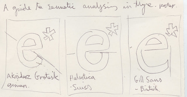
Three different posters aiming to highlight the minor details that would in turn define where the type has been designed. Using the end point of the letter forms and the angle to try and show one being from, Britain, Germany & Switzerland.

COP3 - Ideas Development


A poster project that plays on the preconceptions of the typography origin, asking the viewer the question, does this type feel, Swiss, German, British? Using the reader as the main subject and being as direct in the communication as possible.


- A design of a typeface that uses both 'critical regionalism' as well as following the ideas of postmodernism and its connection to the wider cultural sphere. The type may represent a duel language based area, for example the Spanglish of southern America.


A series of visual tests that questions the viewers knowledge and realisation of both typography and its places of origin. This could be displayed in a working app design or online resource.


 A more subjective and 'form' based look at san serif typefaces displayed large and more add hoc, highlighting the beauty in the details, a possible format could be traditionally printed poster.


- A guide to semiotic analysis of typography, showing the various signifiers and aiming to pin point what makes a typeface have a distinct e.g - 'Germanness' This could be displayed in a printed publication that gives detailed information on the types origin and cultural connections. Using maps to pinpoint locations in terms of their typographic styling.

Monday, December 4, 2017

COP3 - Fourth Tutorial

Within my final COP tutorial of the year, we discussed my essay so far and how I can move forward over the last two weeks and the Christmas period.

I pointed out that I was beginning to understand the semiotic terminology but had no experience with actual semiotic writings, I was shown the writing of Roland Barthes and his semiotic analysis of a French Pasta brand, that has been designed to reflect Italian heritage. 

The writing is complex, yet the key themes are somewhat simple to understand. As pointed out by my tutor, when writing about semiotics it is not enough to only talk about the signifiers and the signified but also about the structural codes that ensure these to be read in certain way. 


When discussing the typography that will be used for analysis we spoke about the work of Johnathon Barnbrook, his typefaces seem to embody so many variations of religions and culturally significant typefaces. Ask explained this can be seen as the embodiment of pastiche reflecting many past styles and influences. 

The Barnbrook Bible gives the an insight into the work of the type designer and explains his process. This could be a vital resource if Barnbrooks work is the choice for analysis. 


As explained Jonathan Barnbrook's work is the embodiment of pastiche, the work uses so many past influences and styles within the types design. The deconstruction of the designs show how strange and unusual iconography can be used to give type an extra dimension. The typeface Bastard has been inspired by the classical German Black letter type that become a taboo typeface in light of its use for the Nazi Party. This shows the connotations that build up with the use of type and how this can be recontextulised.

In terms of workload, I wanted to get further feedback before the Christmas holidays therefore I will need to send over a draft of the completed essay by the end of the week, this could be slightly ambitious but achievable. 


This website, visual-memory has been highlighted as a useful resource in understanding semiotics, aiming to simplify some of the more complex parts of the theory so it is more understandable.