
A poster project that plays on the preconceptions of the typography origin, asking the viewer the question, does this type feel, Swiss, German, British? Using the reader as the main subject and being as direct in the communication as possible.

- A design of a typeface that uses both 'critical regionalism' as well as following the ideas of postmodernism and its connection to the wider cultural sphere. The type may represent a duel language based area, for example the Spanglish of southern America.

A series of visual tests that questions the viewers knowledge and realisation of both typography and its places of origin. This could be displayed in a working app design or online resource.
A more subjective and 'form' based look at san serif typefaces displayed large and more add hoc, highlighting the beauty in the details, a possible format could be traditionally printed poster.

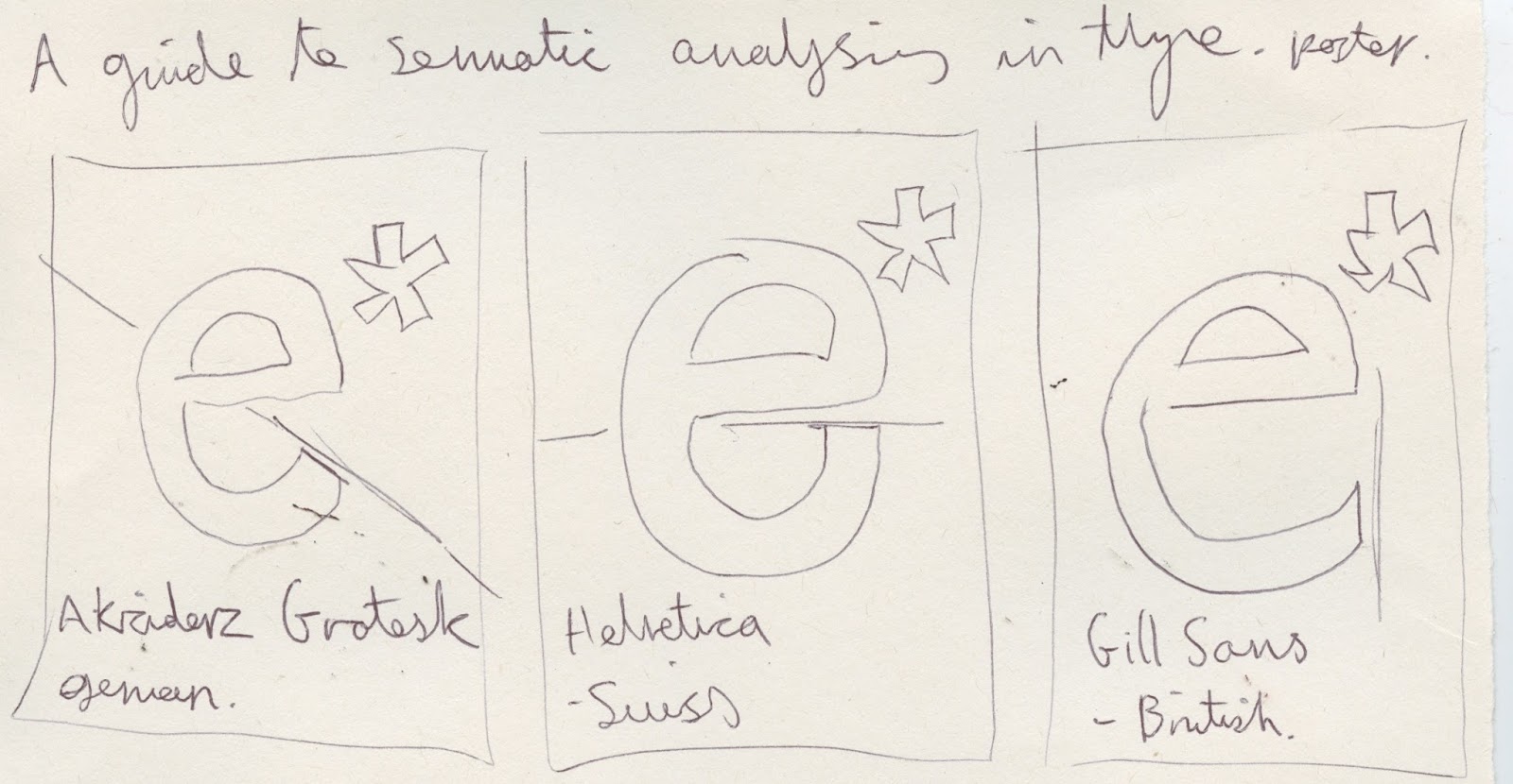
- A guide to semiotic analysis of typography, showing the various signifiers and aiming to pin point what makes a typeface have a distinct e.g - 'Germanness' This could be displayed in a printed publication that gives detailed information on the types origin and cultural connections. Using maps to pinpoint locations in terms of their typographic styling.
No comments:
Post a Comment