
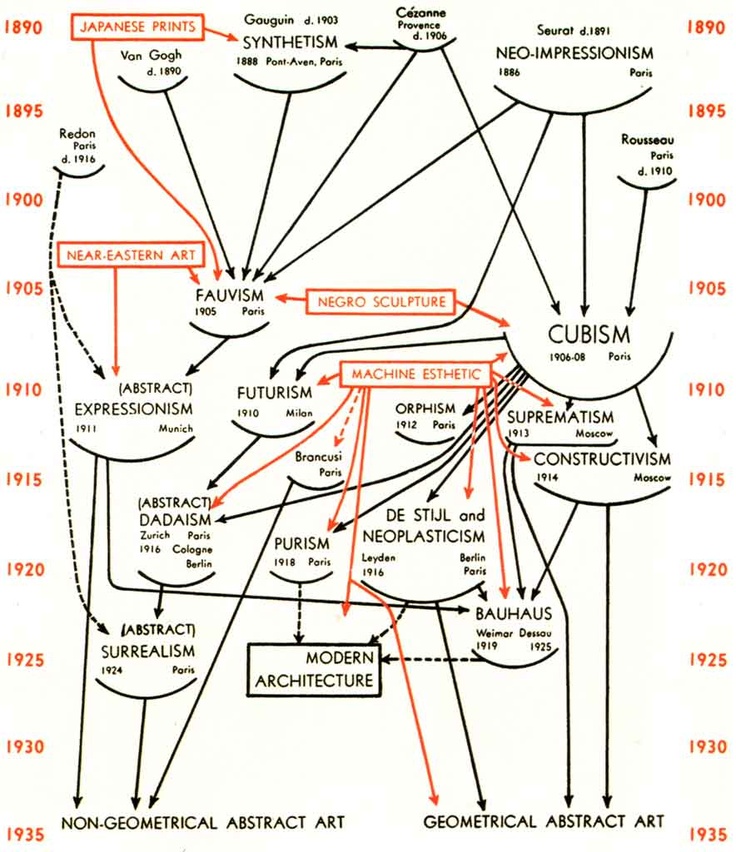
These two images show historical infographics displaying the progression and influence of art over time, this format shows an interesting web of information that can be charted. The use of arrows allows for a interesting understanding of what has influenced others. The time line gives an additional indication to the history and the progression.
There is much to be considered with this kind of infographic, when would it start? what typefaces would be taken into count? If the typefaces in mentioned will be used in the design.
There is an inclusion of the place in which the work has been created for example (Bauhaus, Weimar, Dessau) - This is an option for the poster designs. Gives a further insight into the region of origin and if this gives a further insight into the design.
The designs could also include some more experimental typefaces that further highlight the postmodern and multicultural nature of type design today.
This theme (infographic chart) is a possibly great starting point, it will give an insight into the influences of typography in the 20/21st century and hopefully chart some interesting influences that occur. Use of arrow is something that is key in this poster design and making sure this is clear and well connected is very important. The use of type also is extremely important and will be make or break within this. Considering the large size of the poster there can be some amazing detail within this and show a large number of typeface and at different sizes relative to how important or well used they are.
No comments:
Post a Comment