Wednesday, January 10, 2018
COP3 - Practical Research - 6 Typefaces that changed the world
The CNN article refers to the book by Paul Mcneil, The visual history of typefaces explaining how they can in their own right 'change the world'. The article refers to 6 typefaces that have done this.
http://edition.cnn.com/style/article/visual-history-of-typefaces/index.html
Pail Mcneil explains that he find type so interesting because of ' because of the exceptional richness of its historical connections to technologies, to the aesthetic milieu of different eras and to social and ideological evolution. Type is a microcosmic representation of culture.' This theme of type as a suggestion of an era or reflection of culture is not far from the ideas in my essay.
The article explains how each typeface has been excepted and in some cases rejected by the culture of the era and has gone on to define how type is represented in years to come. The use of Chicago for example has inspired many on screen typefaces, with its design based in pixels it is perfect for on screen use.
This typeface has been chosen for inclusion in the final poster design. As it reflects a new need for typography in response to the computer screen.
Overall this article is refreshing to see a similar topic being published on a large media outlet like CNN.
Monday, January 8, 2018
COP 3 - Practical Developments
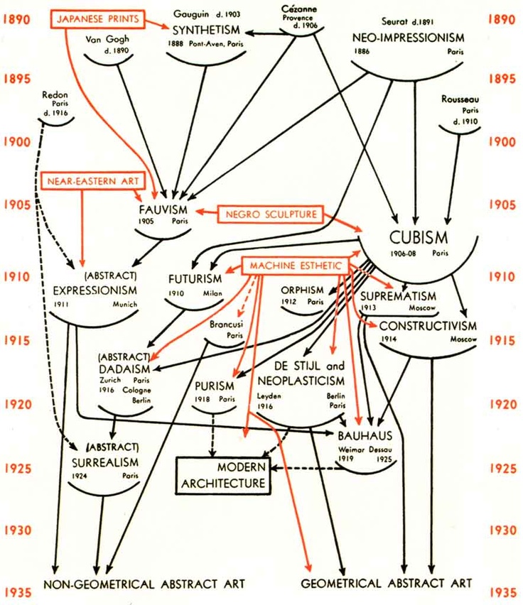
To begin with the practical piece, it is important to outline the typeface's that will make up the poster. The previous poster shows a large number of typefaces that reflect all the diversity on show in san serif type in particular. From this using the standard structure of the original poster, with the time frame down the side and a large number of arrows and connections throughout.
As outlined there is a need for some older typefaces, for example the Tajan typeface from the Tajan Column this typeface was extremely influential on the work of Johnston Sans and Gill Sans afterwards.
At this point in the project i was able to receive feedback on my practical and ask some questions about what I can do to take it further. Using a A3 printed example of the poster asking what the groups thoughts were.
What can be done to push the poster further?
- Use more of the information in your essay to set more of a context to each typeface.
- Include technological developments e.g invention of the Mac computer.
- Show some kind of multinational figures to show how cultural diversity could have impacted the typography.
- Experiment with some different colour combinations?
Does the poster communicate something you didn't know previous to viewing it?
- Yes, the level of detail is clear and there is a lot of research evident in the content.
- Yes for the most part, the information about each sub category of type e.g - Grotesk, Humanist.
- Yes it shows the connections between typefaces really clearly as well as an impression of how many typefaces have been created in the respected times.
- It shows a full development of typography.
How can the poster be closer aligned to my essay connecting to multiculturalism and cultural diversity?
Using different colours or different sections for each country of origin to see if there is any correlation.
Including typefaces from more ethnic minority's designers?
Changing the bottom part of the poster to reflect more radical and expressive design?
Overall this feedback has been extremely useful and will allow me to make changes to try and improve the posters design as much as possible.
The work displayed above, both Type Trumps and Just my type are examples of work that has been designed for type enthusiasts and the typographic language and imagery that have been designed specifically for the target audience. The use of blue colour has also been inspirational to the poster design bellow using similar colour schemes. Overall the communication was interesting yet not direct enough for the final design.
The black on white presented itself as a more impacting and contrasting poster, the white of the type stood out even more with the black background. Impact has been highlighted as something really important within the posters communication. At this point this white on black is the most appropriate.
The two images above show the differences in colour, and how it effects the communication. The grey is a nice medium that shows the black type and the intricate details within each typeface.
The image at the top left is an actual image from the Trajan column, this shows the influences of the humanist typefaces. Overall the type option is more consistent to the rest of the communication.
This image shows coloured arrows, this gives a little more clarity in what influences what within the poster. The structure of the poster shows how as the technology changes as does the typefaces, furthermore the number of typefaces shown reflects how many more typefaces have been created especially since to late 90's.
As outlined there is a need for some older typefaces, for example the Tajan typeface from the Tajan Column this typeface was extremely influential on the work of Johnston Sans and Gill Sans afterwards.
At this point in the project i was able to receive feedback on my practical and ask some questions about what I can do to take it further. Using a A3 printed example of the poster asking what the groups thoughts were.
What can be done to push the poster further?
- Use more of the information in your essay to set more of a context to each typeface.
- Include technological developments e.g invention of the Mac computer.
- Show some kind of multinational figures to show how cultural diversity could have impacted the typography.
- Experiment with some different colour combinations?
Does the poster communicate something you didn't know previous to viewing it?
- Yes, the level of detail is clear and there is a lot of research evident in the content.
- Yes for the most part, the information about each sub category of type e.g - Grotesk, Humanist.
- Yes it shows the connections between typefaces really clearly as well as an impression of how many typefaces have been created in the respected times.
- It shows a full development of typography.
How can the poster be closer aligned to my essay connecting to multiculturalism and cultural diversity?
Using different colours or different sections for each country of origin to see if there is any correlation.
Including typefaces from more ethnic minority's designers?
Changing the bottom part of the poster to reflect more radical and expressive design?
Overall this feedback has been extremely useful and will allow me to make changes to try and improve the posters design as much as possible.
The work displayed above, both Type Trumps and Just my type are examples of work that has been designed for type enthusiasts and the typographic language and imagery that have been designed specifically for the target audience. The use of blue colour has also been inspirational to the poster design bellow using similar colour schemes. Overall the communication was interesting yet not direct enough for the final design.
The black on white presented itself as a more impacting and contrasting poster, the white of the type stood out even more with the black background. Impact has been highlighted as something really important within the posters communication. At this point this white on black is the most appropriate.

The two images above show the differences in colour, and how it effects the communication. The grey is a nice medium that shows the black type and the intricate details within each typeface.
The image at the top left is an actual image from the Trajan column, this shows the influences of the humanist typefaces. Overall the type option is more consistent to the rest of the communication.
This image shows coloured arrows, this gives a little more clarity in what influences what within the poster. The structure of the poster shows how as the technology changes as does the typefaces, furthermore the number of typefaces shown reflects how many more typefaces have been created especially since to late 90's.
This image shows some further tweaks in the posters design. A number of arrows have been included throughout linking the respective typefaces to their previous influences. The poster aims to illustrate the full breath of knowledge developed over this project. The idea is that the poster communicated on a number of levels, so with a quick read or a long read more and less information is clear.
From now there is an opportunity to gain feedback on this poster and contribute further to what is already a interesting and exciting poster in terms of typography.
Friday, January 5, 2018
COP3 - Practical - Typeface Research
TypeFace - Bifur
Year 1929
Paris France
A.m Cassandre
Trajan Pro Regular
Year 114 AD
Carol Twombly
Typeface - Architype catalogue solid.
Year 1970
Wim Crouwel
Amsterdam
Typeface Knockout
Year 1994
Hoefler & Frere-Jones
New York
Typeface - Futura Stencil
Year 1970
Milton Glaser
New York
Typeface - Beans
Year 2008
Charles Grant
Dieter Zempsch
Zürich – Switzerland
Typeface -Gridnik
Year 1976
Wim Crouwel
Amsterdam
Fette Fraktur
Year 1850
Johann Christian Bauer
Typeface - New Alphabet
Year - 1967
Wim Crouwel
Amsterdam
Typeface - Shatter
Year 1973
Vic Carless
Myriad Pro
Year 1992
C.Twombly
R.Slimbach
California
Bayer Universal
Year 1925
Herbert Bayer
Dessau
Univers
Year 1954
Adrian Frutiger
Zurich Switzerland
Avant Garde
Year 1978
Herb Lubalin
New York
Tschichold Architype
1929
Jan Tschichold
Futura
1927-1928
Paul Renner
New Rail Alphabet
Year 2009
Margaret Calvert
Jock Kinneir & Henrik Kubel
Zapf Dingbats
1978
Hermann Zapf
Van Der Leck
1941
Bart Van Der Leck
Tephra 0
2007
Hamish Muir
London
Transport
1963
Margaret Calvert
& Jock Kinneir
Bastard
1990
Jonathan Barnbrook
Typeface Six & Seven
1991
Neville Brody
Gill Sans
1927 - 1930
Eric Gill
Helvetica
1957
Max Miedinger
Zurich Switzerland
Baby Teeth
1968
Milton Glaser
New York
Johnston Underground
1916
Edward Johnston
London
Arete Mono
1999
Jim Marcus
Chicago
Akzidenz Grotesk
1896
Günter Gerhard Lange
Berlin
These typefaces formulate the main information of the poster, each will be ordered from it date and creation. Each has been selected for its modernity, inspiration in terms of the history of type as well as their ability to reflect an era or time. And their influence on culture.
Thursday, January 4, 2018
COP3 - Practical - Research
These two images show historical infographics displaying the progression and influence of art over time, this format shows an interesting web of information that can be charted. The use of arrows allows for a interesting understanding of what has influenced others. The time line gives an additional indication to the history and the progression.
There is much to be considered with this kind of infographic, when would it start? what typefaces would be taken into count? If the typefaces in mentioned will be used in the design.
There is an inclusion of the place in which the work has been created for example (Bauhaus, Weimar, Dessau) - This is an option for the poster designs. Gives a further insight into the region of origin and if this gives a further insight into the design.
The designs could also include some more experimental typefaces that further highlight the postmodern and multicultural nature of type design today.
This theme (infographic chart) is a possibly great starting point, it will give an insight into the influences of typography in the 20/21st century and hopefully chart some interesting influences that occur. Use of arrow is something that is key in this poster design and making sure this is clear and well connected is very important. The use of type also is extremely important and will be make or break within this. Considering the large size of the poster there can be some amazing detail within this and show a large number of typeface and at different sizes relative to how important or well used they are.
Wednesday, January 3, 2018
COP3 Practical - Transport Type Posters
Typographic Posters exploring the typefaces that have become linked to a place or region. New York and Helvetica. London with Johnston Sans. Germany with Din Condensed.
The posters aim to demonstrate how just typography and colour and a few key shapes and symbols can begin to create really recognisable graphic outcomes that seem familiar.
Overall the communication works yet some refinement of fine detailed will perfect this communication. However this is more of a simple experiment and further development will be needed for this to be considered a final practical.
COP3 - Practical
Within this point in the project, the written aspect of the brief is all working well, but ideas for the practical need to be refined and pushed further, asking a number of questions about how it should be created will hopefully uncover this.
What is it you want to communicate in the practical?
Illustrate the relationship between typography and regions, and visual era's.
How can this be communicated?
Through a visual outcome that highlights the differences/ lack of differences that have been outlined in the essay. Communicating the fundamental of what we know and what this indicates. (getting the audience to think)
What needs to be at the forefront of the communication?
That type is not a fixed entity, it changes, tastes change and it is more about its use than the history.
What format fits the contents direct communication?
A large poster, communicates information quickly, and can display a large amount of different information. It can also communicate without the need for any extra supporting content.
How can this projects practical be taken further and aim to be innovative?
Include some information that people don't know about, something that challenges their perceptions of type, is very interesting and possibly shocking..
These questions will aide the process of refining my own ideas. Now is the time to begin really having a go at these practical solutions to this project.
Tuesday, December 12, 2017
COP 3 - Semiotics - Bastard Typeface

The experimental typeface ‘Bastard’ designed in 1988, by Jonathan Barnbrook, responses to the lack of appreciation shown to black letter typography, and how he felt there was a certain taboo against its use due to its connection with fascism. ‘I was really interested in the history of Blackletter, a neutral style of letterform that had been hijacked by the Nazis, but was so central to the development and history of typography. I felt that it was important not to ignore their five hundred years of influence while acknowledging their twentieth century fascit associations.’ (Barnbrook, 2007) Barnbook’s typographic experiments have a clear appreciation of past styles being influential in its design, reflecting the postmodern theories of pastiche, he explains that he aims to not ‘just copying past letterforms. I am not interested in doing a ‘revival’. What is important is to reinterpret the beauty that you have found in a contemporary way, to acknowledge that it exists in a different way, to acknowledge that it exists in a different society now. That the letterforms are a valid response to the way people use language today.’ (Barnbrook, 2007) The (Figure 6) Bastard typeface, again displays the letterforms A ë s and G, the image yields a number of sporadic signs, removed from its linguistic message, the clarity of each letter is difficult to read, yet there is a clear connection to Germanic Blackletter typography, evident in the elongated letterforms and sharpe calligraphic edges, readability has clearly been disregarded in the typefaces design. In the typeface there are constant hints of more contemporary graphic jargon, the use additional shapes and symbols, in turn define this typeface as contemporary. When comparing Figure 6 & 2 (Bastard & Helvetica) the way the signs value is determined is much more evident, the clarity of the letterforms has taken a back foot and the aesthetic value then at the forefront. Barnbrooks typeface designs are influenced heavily by past styles, as he explains the influences for the typeface Manson - ‘is a tightly wound and unnerving exposition on beauty. It references the centuries-old tradition of stone carving, elements of classical architecture and letterforms found in Medieval manuscripts, but also the headstones of desolate North London cemeteries, the cross-hairs used in aiming a firearm, and the nihilistic horror of one of the most infamous serial killers of the twentieth century.’ (Barnbrook, 2007) All of Barnbrooks typefaces have been designed to represent his own social commentary of the multicultural and multi-influential nature of culture in the present day.
- This analysis has been useful in testing the semiotic theory but will not make it to the final essay.
Subscribe to:
Posts (Atom)