Saturday, April 22, 2017

OUGD501 - Evaluation

During this module I have been more relaxed about allowing for the project to change, from the beginning when selecting an essay question to begin researching I originally wanted to look at the influences and links of architecture within graphic design. It was not until further reading and research that I realised that this question would be too broad and difficult to answer. Natural progression within projects is a process that I am still learning, but I have learnt to embrace this change. My essay question moved more and more towards modernism and looking at the earliest advancements in the work of the Bauhaus and De Stijl. Through further reading and research, I feel my understanding of the topic and what defines modernism has greatly improved. In terms of writing I have always found this to be a weak point in my work but in second year I have tried to push this, becoming aware of multiple theorists, finding less obvious sources and try to push my writing to be more interesting and critically aware. I don’t feel totally satisfied with this area but making sure I began my essay early and stayed on top of deadlines made this process much more straightforward.

In terms of the practical side of this project, being honest I found it a little hard to get started, but once I had, I have found it to be really enjoyable and overall I am pleased with what I have produced. Looking into modernism and the work associated with the movement has been really useful, this is work that I feel I know really well and love so it set a great basis for the project. On top of this the work of modernism is so visual and dynamic this allowed my practical to share such dynamism. In terms of the effectiveness of my practical work, through my small questionnaire I found that it seemed to be interesting and visually appealing, the direct nature of the communication was an area that seemed to go down well, as well as the clear links shown between the various pieces of art, architecture and furniture, this was really positive to see. I would agree with the comments that the booklets could have done with more explanation, if I was to do something different next time that would be changed. I would say that the practical work was a little safe and I could have explored some more innovative approaches but one thing that I am really pleased with is synthesis between the practical work and the essay, the inclusion of quotes taken from my essay only added to the communication showing how they tied together well. Feedback has been an on-going process that has really governed my decisions and I feel increasingly aware of the importance of gaining feedback and above all documenting this.


Overall this module has been a great learning curve and my confidence in writing has improved. In terms of my general question and argument it does feel slightly dated and for my COP 3 I would like to explore some more contemporary themes, and again improve from the previous years work as this is progression is really important to me and my practice.

Friday, April 21, 2017

OUGD501 - Interpretation of feedback.


To test the reception and effectiveness of the outcomes using a small questionnaire gathered extremely useful feedback from peers. As they are all, design contentious, have a knowledge of modernism, and are engaged and interested in the subject.

How effectively does the work communicate the links within modernist design and geometry?
- They explained, it is clear to see the links between the various art forms (art, architecture, furniture design) showing a good range of examples. As well as the use of grids further outlining this connection with modernism. However one piece of feedback said that a further explanation was need in the booklet as it leaves the reader to interpret the concept themselves.


Do you think the poster or the booklet is more effective in this communication?
They explained the poster was effective in showing an overview of the concept in a fast and impactful way and in contrast the booklet highlights the further details. They explained the use of quotes was really useful in understanding the links between geometry and modernism and before reading this it was a little unclear. One explained that as a set they are most effective but the posters size would effect distribution.


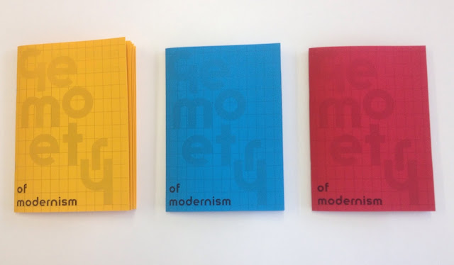
Out of the range of three booklets which colour is most effective/appropriate? - One explained that the yellow worked due to the consistency with the poster and that the contrast of black on yellow was the most legible, however in contrast to this others thought that the blue and red was more effective as it was different to the poster. A few people felt it was the fact they were in a set that made it more interesting. 


What could improve the two practical pieces? - In terms of improvements more of an explanation was highlighted, as well as the possible inclusion of another modernist typeface, another suggestion was looking at online content and its effects on distribution. Furthermore there were suggestions of experimenting further with the size and scale of the booklet, a circle, triangle and square booklet was suggested. 

Does the design reflect an understanding of geometry in modernism? - As explained the use of shape and line and type acts visual communicators of the subject. As well as a clear use of grids. 

Where would you see the booklets and poster distributed? - Mainly the suggestions included museums, galleries, at the Bauhaus archive. Additionally some one suggested in design studios that have connections with modernism in their practice. 


Overall this feedback has shown the project to be effective and relevant, the main improvement could be the inclusion of more of an explanation of modernism and geometry in both the poster and the booklets. 

OUGD501 - Feedback on Outcomes

One the practical work had been finished, it was useful to create a small questionnaire and ask a number of my peers to fill it out, as they in a way would form the perfect target audience, all creatives, design continuous with an understanding of modernism. Their comments would be the perfect test of the practical works success overall. 


OUGD501 - Booklet Design & Production


Following on from the poster designs, this layout for a booklet has been created. This is to try and further inform the viewer and audience of the impact of geometry, using more examples, different imagery coming together to form a small zine/booklet publication. The design has been created to try and educate designers and creatives on geometry in modernism and try to draw some possible links between various areas of design (art, architecture and product design). 


The cover design is partly informed by the work of Sacha Lobe, but looks a geometrical composition of the word geometry. This cover shown was experimented with but the colours appeared slightly too jarring and off putting.  


These jpeg images show the front cover the spreads and the back cover, all have been designed to be cohesive together and visually reflect the previous poster. The use of the Herbert Bayer lowercase typeface connects the editorial design and layout to modernism. 


All the works selected have the common theme of being unified through modernism. 


Creating a number of test prints and putting them together helped understand how the booklet would read and what more needed to be included. The cover variations where to try and find the best combination of layout and tone. A grid was extended from the cover to the back cover to highlight their influence in modernism as well as on the composition of the publication. 

The A5 format keeps the production costs low and fits the double sided confinements within the college facilities. 

Advantages - Low cost, quick and cheap to produce, easy to bind. Only uses a single colour. Hand held. 

Limitations - smallish scale, not the highest quality finish. 

Overall these test pieces have allows a clearer view of how the designs are put together and the limitations and advantages the production allows. 


Following on from the initial mock ups more finalised and well finished publications have been produced. Created on three coloured papers to relate to the primary colours associated with modernism. The production method allows for the designs to be printed in black and white on coloured paper, keeping the costs low but remaining dynamic and eye catching. 

The idea of using the three coloured booklets comes partly from the Hey Studio 1 2 3 series of notebooks. 


The simple use of type and colour makes for a really interesting design but is cheap and easy to produce. 


The booklets have been designed to work alongside the poster, overall it is successful in communicating more about geometry in modernism and hopefully giving more about the subject. The practical outcomes work alongside the essay appropriately, looking at the themes of modernist theory as well as aesthetic values. It has been a difficult task to try and show modernist ideas within a practical piece but hopefully this booklet shows an further understanding.