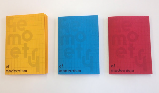
Following on from the poster designs, this layout for a booklet has been created. This is to try and further inform the viewer and audience of the impact of geometry, using more examples, different imagery coming together to form a small zine/booklet publication. The design has been created to try and educate designers and creatives on geometry in modernism and try to draw some possible links between various areas of design (art, architecture and product design).

The cover design is partly informed by the work of Sacha Lobe, but looks a geometrical composition of the word geometry. This cover shown was experimented with but the colours appeared slightly too jarring and off putting.
These jpeg images show the front cover the spreads and the back cover, all have been designed to be cohesive together and visually reflect the previous poster. The use of the Herbert Bayer lowercase typeface connects the editorial design and layout to modernism.
All the works selected have the common theme of being unified through modernism.
Creating a number of test prints and putting them together helped understand how the booklet would read and what more needed to be included. The cover variations where to try and find the best combination of layout and tone. A grid was extended from the cover to the back cover to highlight their influence in modernism as well as on the composition of the publication.
The A5 format keeps the production costs low and fits the double sided confinements within the college facilities.
Advantages - Low cost, quick and cheap to produce, easy to bind. Only uses a single colour. Hand held.
Limitations - smallish scale, not the highest quality finish.
Overall these test pieces have allows a clearer view of how the designs are put together and the limitations and advantages the production allows.
Following on from the initial mock ups more finalised and well finished publications have been produced. Created on three coloured papers to relate to the primary colours associated with modernism. The production method allows for the designs to be printed in black and white on coloured paper, keeping the costs low but remaining dynamic and eye catching.
The idea of using the three coloured booklets comes partly from the Hey Studio 1 2 3 series of notebooks.
The simple use of type and colour makes for a really interesting design but is cheap and easy to produce.
The booklets have been designed to work alongside the poster, overall it is successful in communicating more about geometry in modernism and hopefully giving more about the subject. The practical outcomes work alongside the essay appropriately, looking at the themes of modernist theory as well as aesthetic values. It has been a difficult task to try and show modernist ideas within a practical piece but hopefully this booklet shows an further understanding.


No comments:
Post a Comment