This image above is the cover I have selected for my magazine, after comparing a few different possibilities this image best reflects the content of the magazine and remains eye catching and engaging. The use of type really brings out this, the graphic nature of TIMMONS NY that I have identified being used in the AdBusters magazine.
This page is my into page and contents page, using black and white backgrounds with white and black type makes the content really stand out. I wanted to keep the consistency from the cover and the black background emphasis this. Using a different typeface for each of the pieces of content on show in the magazine mean each are distinctive and different, this puts emphasis on the fact each section of the magazine explores political art and design in very different mediums. These pages show an introduction into the magazine and have been designed without images for this reason.
This next spread is on the recent burning of Donald Trump effigies in Mexico, I wanted the layout of images to reflect the different stages of it being carried to being set on fire and then being burnt. The two images on the far right hand side are the most engaging so they have been made very large. The type then sits alongside this, as this is more of a playful feature of the magazine this had to be reflected in the designs as shown above.
This spread is for the feature on Ai Weiwei's recent work at the Konzerthaus building in Berlin, as the image is very striking displaying it full bleed on the right hand page then all the type on the right puts the emphasis on the bright orange of the 14,000 refugees life jackets. The type on the left as Ai Weiwei has been so influential not only in modern political art but in my project, I wanted to display his name in an as impacting and way as possible, the use of the large AI adds to this alongside the black background and white type. The type dominates the space and reflects nicely the columns of the building and artwork.
This spread looking at Political Murals it was vital in the designs to make sure all the images are as large as possible and show the different scales of each mural. As red and black stands out in these images I wanted to use the image with the most red at the bottom of the page and the least or no red at the top, this creates a appropriate hierarchy to the designs and intuitively feels right. This compositions allows for an appropriate amount of space for the fairly large amount of text.
This feature on James Bridle's Drone Shadow project, I have kept the design consistent from the initial designs but made space for text on the right hand side.
In conjunction with the first double page on James Bridle this page features a small essay written by James Bridle. I wanted to make the design engaging so creating a outline in the type of a drone assisted me with this. Using arranged left type made the designs much more clear I changed the number of columns on the double page from six to four this again emphasises clarity. I made sure each line was as consistently place and the overall slug of the type was easy to read.
 This page for JR I have kept similar from the initial designs. I looked as using alternative characters in the typeface to make sure the information is communicated in as clear way as possible. The more rigid letter R shown above felt much more consistent and appropriate.
This page continues on from the page above on the artist JR I have once again not changed much from the initial designs, I wanted to let the images be the focus and show best the large scale of the designs.
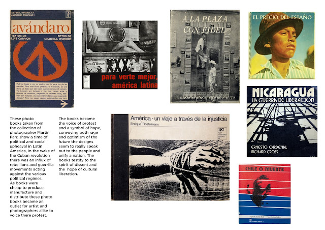
This final double spread features the Latin American photo books. As seen in the Tate modern the book covers have been displayed in a layout that looks to emphasis the varying styles on show in the book designs. The layout additionally needed to have a large amount of space for the type.
This image is the back page of the magazine, keeping the designs as minimal as possible just featuring my name and link to website. Overall the designs of this magazine I feel reflect my research into Adbusters and Baseline magazine. Being impacting and engaging were the two design elements I knew I wanted to include in this design and I feel this is echoed throughout the publications design.


No comments:
Post a Comment